library("readr")
library("sf")
library("dplyr")

difftime_secs <- function(x, y){
  as.numeric(difftime(x, y, units = "secs"))
}

distance_by_element <- function(later, now){
  as.numeric(
    st_distance(later, now, by_element = TRUE)
  )
}Exercise B
In preparation, you’ve read the paper by Laube and Purves (2011). In this paper, the authors analyse speed at different scales and compare these different values. Let’s conceptually reconstruct one of the experiments the authors conducted.
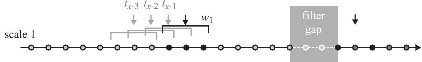
Figure 8.1 shows how speed was calculated in the first of three scales. Do you notice how their method differs to how we calculated speed? We calculation the speed for a specific sample to be the distance travelled to the next sample devided by the according time difference. Laube and Purves (2011) use the distance travelled from the previous sample to the next sample (and the according time difference).
To reproduce this experiment, we will use a new wild boar dataset with following characteristics:
- Small number of samples (200 locations)
- Only one individual (caro)
- A constant sampling interval (60s)
This last aspect is important, since we would otherwise have to deal with varying sampling intervals, which would greatly complicate things. Download this dataset here: caro60.csv. Import it just like you imported the other wild boar data and save it to a new variable named caro (note that the locations are stored in EPSG 2056).
We will need the following to functions from Exercise A:
We can then import the data. We can discard all columns with the exception of DatetimeUTC with select (see below).
caro <- read_delim("datasets/caro60.csv", ",") |>
  st_as_sf(coords = c("E","N"), crs = 2056) |>
  select(DatetimeUTC)
Task 1: Calculate speed at scale 1
In our first scale, we will assume a sampling window \(w\) of 120 seconds. This conveniently means that for every location, you can use the previous and next location to calculate speed. Try to implement this in R.
After completing the task, your dataset should look like this:
head(caro)Simple feature collection with 6 features and 4 fields
Geometry type: POINT
Dimension: XY
Bounding box: xmin: 2570489 ymin: 1205095 xmax: 2570589 ymax: 1205130
Projected CRS: CH1903+ / LV95
# A tibble: 6 × 5
DatetimeUTC geometry timelag steplength speed
<dttm> <POINT [m]> <dbl> <dbl> <dbl>
1 2015-09-15 08:07:00 (2570589 1205095) NA NA NA
2 2015-09-15 08:08:00 (2570573 1205096) 120 52.4 0.437
3 2015-09-15 08:09:00 (2570536 1205099) 120 58.4 0.487
4 2015-09-15 08:10:00 (2570518 1205115) 120 49.2 0.410
5 2015-09-15 08:11:00 (2570499 1205130) 120 32.6 0.272
6 2015-09-15 08:12:00 (2570489 1205130) 120 18.0 0.150Task 2: Calculate speed at scale 2
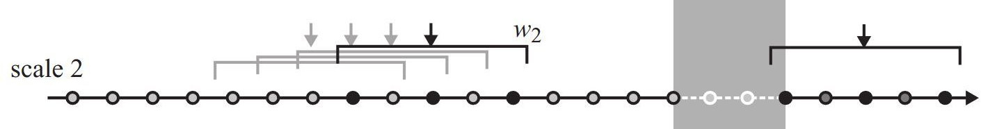
To compare the effect of different sampling intervals, Laube and Purves (2011) calculated speed at different scales (i.e. different sampling windows \(w\)).
In the previous task, we assumed a \(w = 120s\). In this task, try to implement \(w = 240s\) (see Figure 8.2), which means using an offset of 2.
- Tip: Use the
n =parameter inlead/lagto increase the offset. - Store values timelag, steplength and speed in the columns
timelag2,steplength2andspeed2to distinguish them from the values from scale 1
After completing the task, your dataset should look like this:
caro |>
  # drop geometry and select only specific columns
  # to display relevant data only
  st_drop_geometry() |>
  select(timelag2, steplength2, speed2) |>
  head()
# A tibble: 6 × 3
timelag2 steplength2 speed2
<dbl> <dbl> <dbl>
1 NA NA NA
2 NA NA NA
3 240 96.5 0.402
4 240 90.8 0.378
5 240 59.6 0.248
6 240 37.3 0.155Task 3: Calculate speed at scale 3
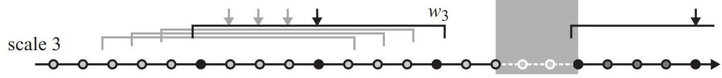
Redo the previous task with \(w = 480s\) (offset of 4)
After completing the task, your dataset should look like this:
caro |>
  st_drop_geometry() |>
  select(timelag3, steplength3, speed3) |>
  head()
# A tibble: 6 × 3
timelag3 steplength3 speed3
<dbl> <dbl> <dbl>
1 NA NA NA
2 NA NA NA
3 NA NA NA
4 NA NA NA
5 480 102. 0.214
6 480 82.5 0.172Task 4: Compare speed across scales
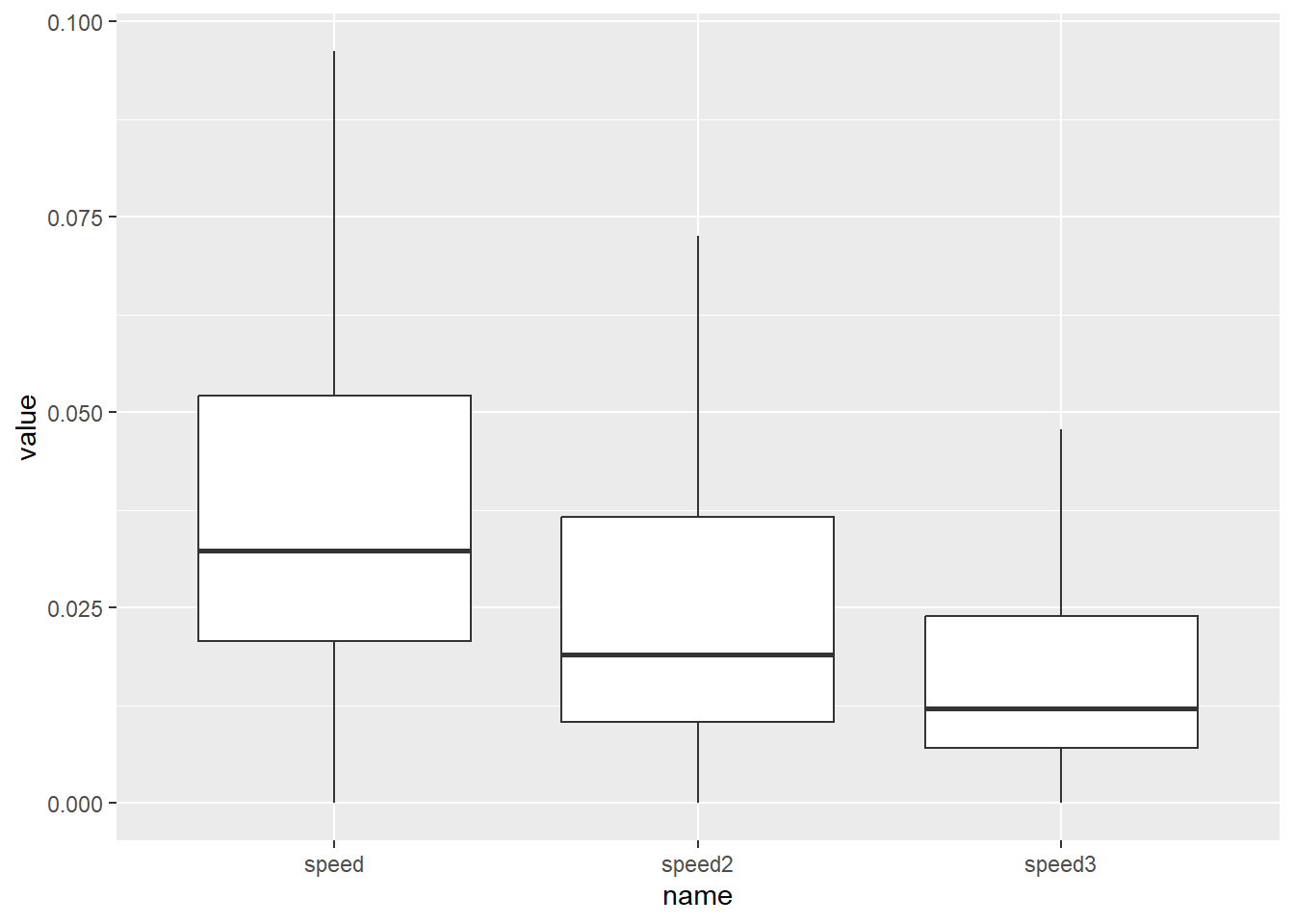
We now have a dataframe with three different speed values per sample, corresponding to the different scales / sampling windows (\(w_1 = 120s\), \(w_2 = 240s\) and \(w_3=480s\)). It would now be interesting to compare these measurements and see our results correspond to those of Laube and Purves (2011). In their experiments, the authors observe:
- A steady decrease in median speed as the temporal analysis scale increases;
- A decrease in the overall variance in speed as the temporal scale increases;
- Lower minimum values at the shortest temporal scales;
The authors visualize these observations using box plots. To to the same, we need to process our data slightly. Currently, our data looks like this:
caro |>
  st_drop_geometry() |>
  select(DatetimeUTC, speed, speed2, speed3)
# A tibble: 200 × 4
DatetimeUTC speed speed2 speed3
<dttm> <dbl> <dbl> <dbl>
1 2015-09-15 08:07:00 NA NA NA
2 2015-09-15 08:08:00 0.437 NA NA
3 2015-09-15 08:09:00 0.487 0.402 NA
4 2015-09-15 08:10:00 0.410 0.378 NA
5 2015-09-15 08:11:00 0.272 0.248 0.214
6 2015-09-15 08:12:00 0.150 0.155 0.172
7 2015-09-15 08:13:00 0.195 0.140 0.0868
8 2015-09-15 08:14:00 0.206 0.124 0.0652
9 2015-09-15 08:15:00 0.104 0.146 0.0795
10 2015-09-15 08:16:00 0.101 0.109 0.0848
# ℹ 190 more rowsWe can make a box plot of a single column using ggplot2:
library(ggplot2)

ggplot(caro, aes(y = speed)) +
    # we remove outliers to increase legibility, analogue
  # Laube and Purves (2011)
  geom_boxplot(outliers = FALSE)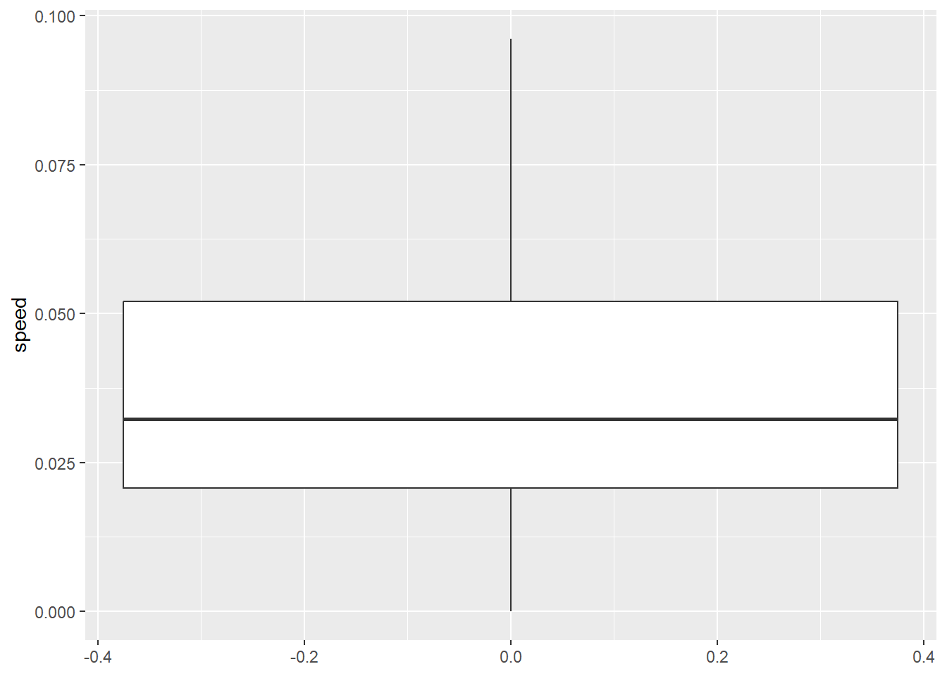
However, if we want to compare speed with speed2 and speed3, we need need a long table rather than wide one (which is what we currently have). To make our table long, we can use the function pivot_longer from tidyr:
library(tidyr)

# before pivoting, let's simplify our data.frame
caro2 <- caro |>
  st_drop_geometry() |>
  select(DatetimeUTC, speed, speed2, speed3)

caro_long <- caro2 |>
  pivot_longer(c(speed, speed2, speed3))

head(caro_long)
# A tibble: 6 × 3
DatetimeUTC name value
<dttm> <chr> <dbl>
1 2015-09-15 08:07:00 speed NA
2 2015-09-15 08:07:00 speed2 NA
3 2015-09-15 08:07:00 speed3 NA
4 2015-09-15 08:08:00 speed 0.437
5 2015-09-15 08:08:00 speed2 NA
6 2015-09-15 08:08:00 speed3 NA ggplot(caro_long, aes(name, value)) +
# we remove outliers to increase legibility, analogue
# Laube and Purves (2011)
geom_boxplot(outliers = FALSE)